|
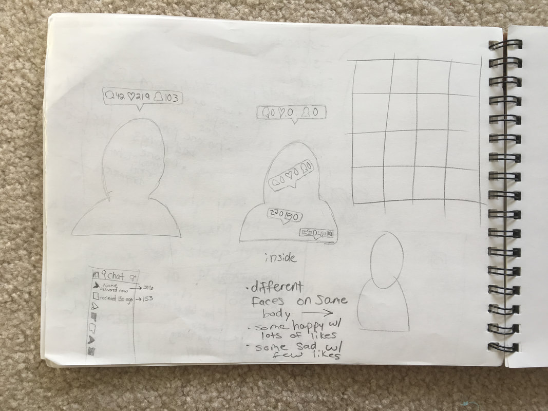
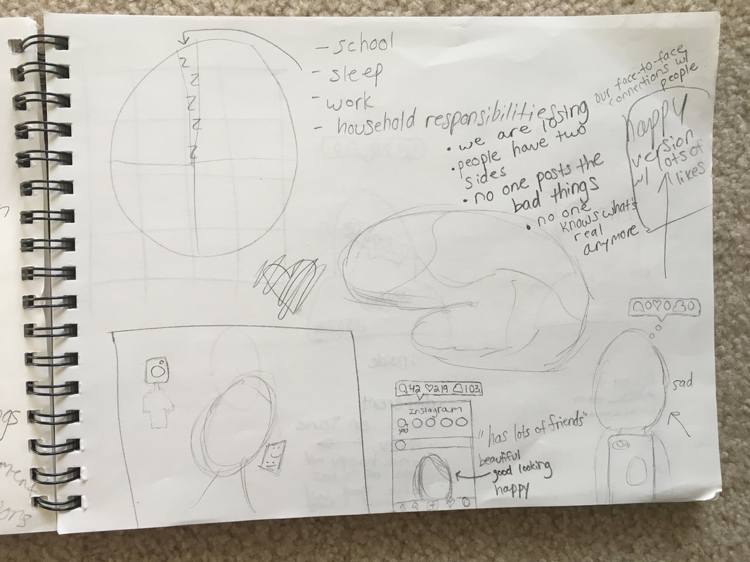
When beginning this project, I had originally planned to make the theme, high school/ teenagers. To do this, I was going to make a pie chart representing everything a teenager is expected to do in a day. The point of this was going to be to show how little time we have for additional activities and even things like sleeping and studying. As I begin to plan this idea out, I just wasn't loving the idea. It seemed very basic, and I wasn't sure if anyone would get its message. After a few more ideas, I changed my "topic" to social media. In today's era this is a very relevant thing. In my piece, I wanted to be able to get across the message of people placing their worth in the number of "likes," "friends," or "shares" they receive. I made my concentration Instagram, because I am the most familiar with how this program works as opposed to others. Many people are obsessed with taking the perfect picture just so they can receive the most attention online. I have caught myself doing the same thing at times, and it's crazy that these "likes" can affect how we feel about ourselves. Once I was set on my idea, I took pictures of about twelve people, and then edited them. I cropped each one, adjusted the brightness and contrast, and then made a 3x3 grid to place the pictures in. I had wanted to use all twelve pictures I had originally took, however some were blurry, so I was left with nine. Once all of the pictures were in the grid, I played around with the different filters I could use. Over the course of this class, I have begun to appreciate black and white photography more and more. I believe it evens out the whole picture, allowing you to choose where the audience's attention is drawn to (for example, with a pop of color in one area). This is the reason why I went with b&w for this project. However you'll notice in the final project that some pictures (the "happy" ones are a brighter b&w, while the "sad" ones are darker) Above are my in progress pictures, after they had been edited the first time. Now that all of the pictures were in the layout I wanted and in their respective black and white values, I began creating the Instagram "like bubble." This is the notification that appears when someone has liked a picture of yours, wants to become your friend, or commented on your picture. This part of the project took longer than the picture editing, because I had to use trial and error to create the icons. After numerous instructional videos on how to make hearts and speech bubbles, I was finally very pleased with how it turned out. 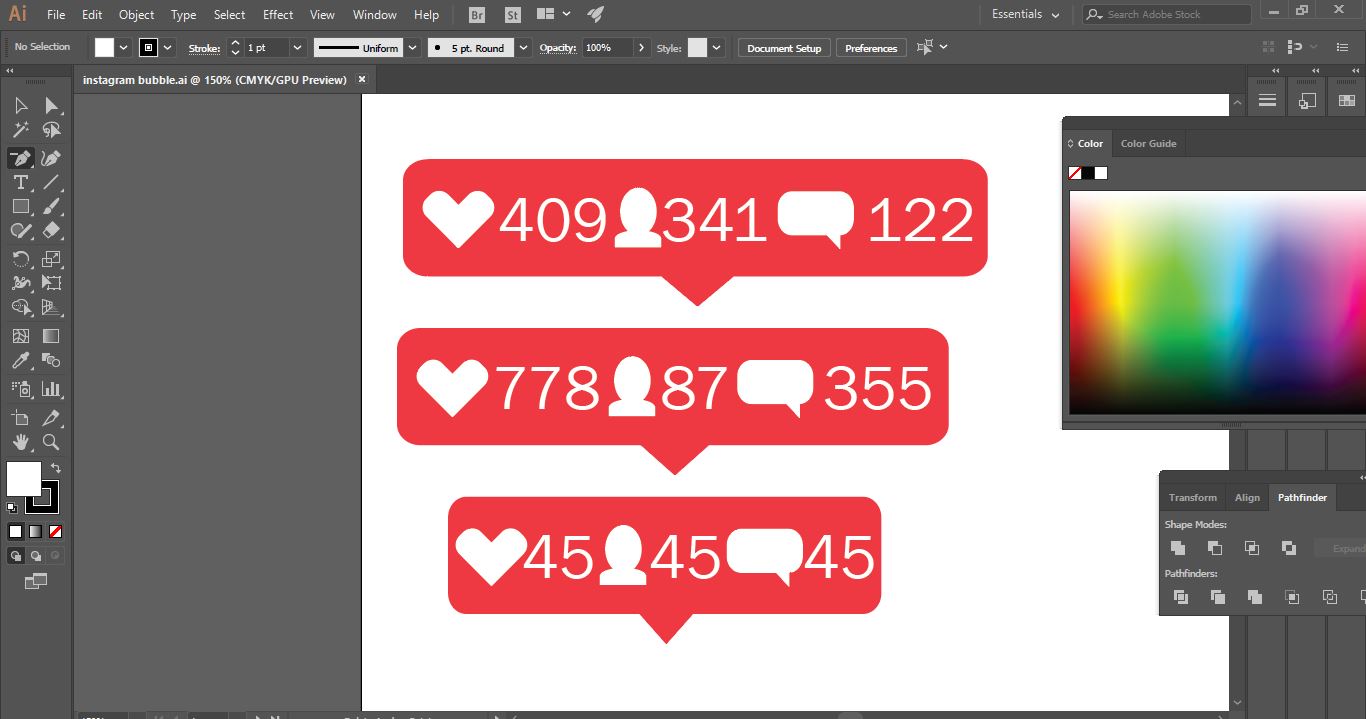 The final step of my project was to create a bubble for each person. For the people with "sad faces" I gave them no likes, friends, or comments. For those with a "happy face", I gave them lots of all three things. I did this to make my social commentary clear. I wanted others to see that people view themselves certain ways because of the amount of attention they receive online. They feel good about themselves if they get a lot of likes, but feel worthless when they don't. This is why I put the bubble over their eyes, because their vision is blurred based off of these likes. Overall I believe this project was very successful. If I could change anything it would be to play around with new filters, instead of always resorting to b&w. 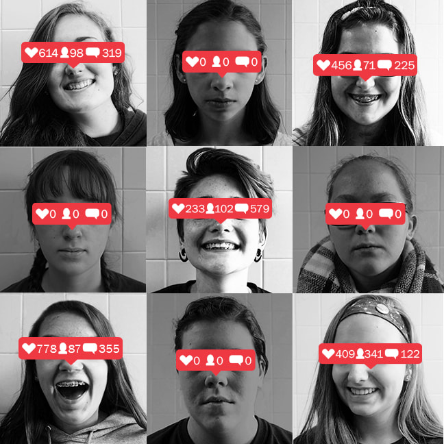
0 Comments
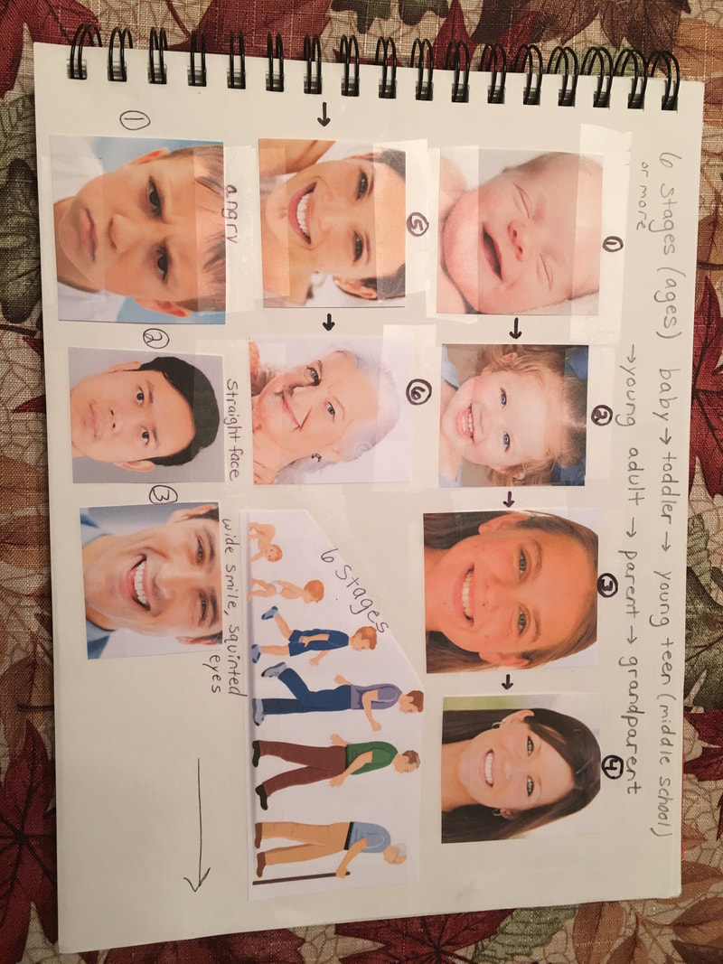
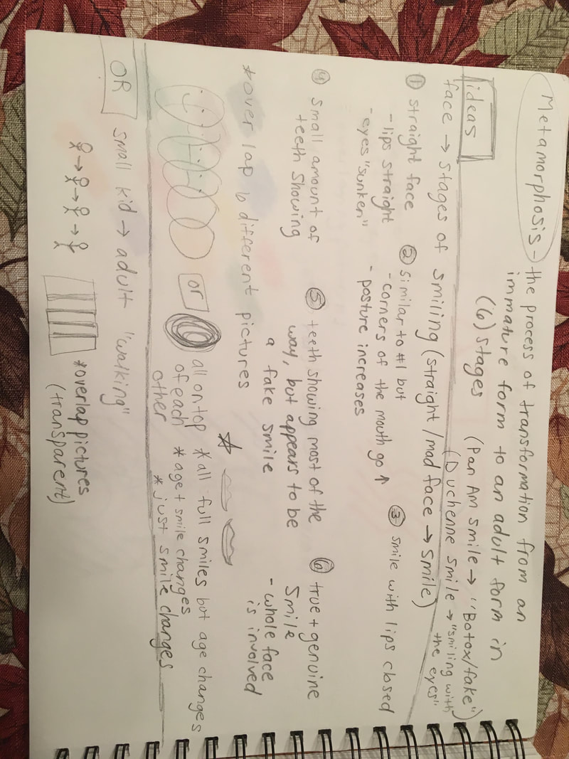
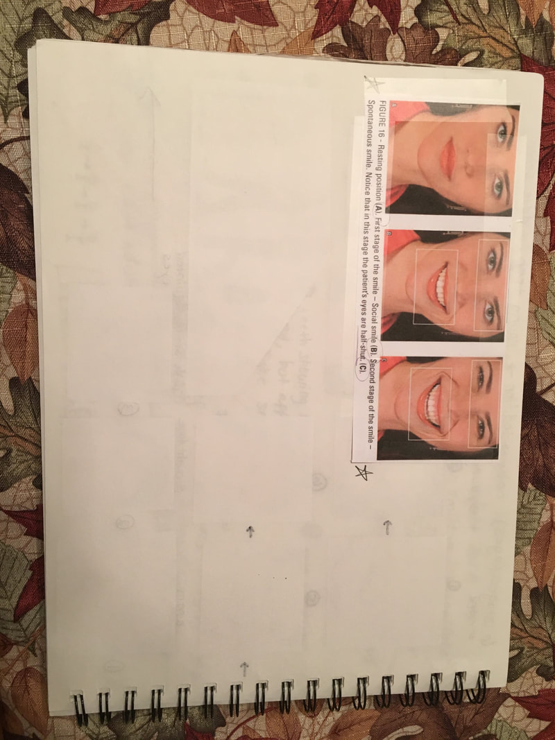
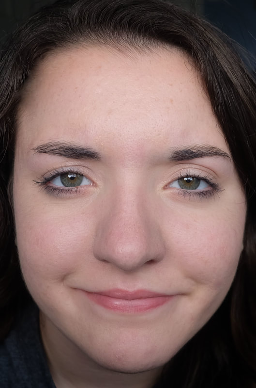
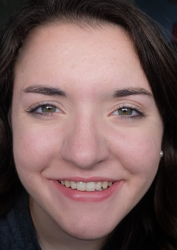
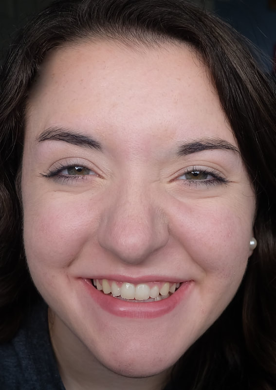
Just like my last project, I knew again that I wanted to do this project digitally. I didn't know how I wanted to show it, but I knew I wanted my metamorphosis to involve smiles. One idea I considered was to have one person's face used, and have their smile transition from an angry face to a smiling face. Another idea was to have every one of the 6 people smiling, but have the person's age change. To better explain these ideas, I included reference images in my sketchbook, along with sketches and pictures describing the stages of a smile. After sketching, I had decided to take pictures of myself, and show the transition from a mad face, to a smiling one. I first began by taking the pictures and then editing them inPhotoshop to remove any blemishes. Now that I had taken and edited each picture individually, I began to combine the separate pictures into one. Placing each picture next to each other just in a line did not sound very interesting, so I played with overlapping them. I changed the opacity of each image to allow the previous layer to be seen through the one after it. While it did make my pictures slightly slanted, I matched up my left eye up with the right eye before it. This allowed for new "faces" to be formed in between the "real" faces. It created a sort of optical illusion. 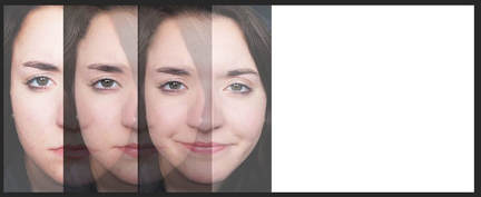 In Progress This project created problems for me, just like any other project. It required me to learn more and more about Photoshop. However some problems just couldn't be fixed. After my work was critiqued, I realized that I should try and "erase" the lines formed from the overlapping pictures. After days of googling and trial and error, I finally had to let the problem go. Nothing I tried solved the problem. I am happy with this project though, despite this problem I had. With each project I am learning more and more. 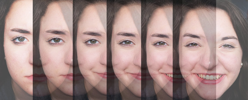 Final Project
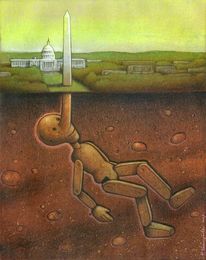
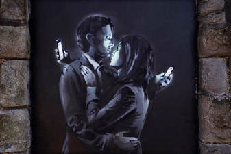
Here are my two examples of social commentary. The message I got from the left image is that the man is Pinocchio hiding under Washington D.C. This is trying to tell us that what the capital tells us is a lie. For the second example, it shows that we are more in love with our phones than with other people. We have a hard time connecting to others emotionally and in person sometimes, because of our obsession with phones.
|
AuthorI am a senior art student at Shippensburg Area Senior High School with a love for graphic design, interior design, and photography. Archives
December 2017
Categories |
 RSS Feed
