|
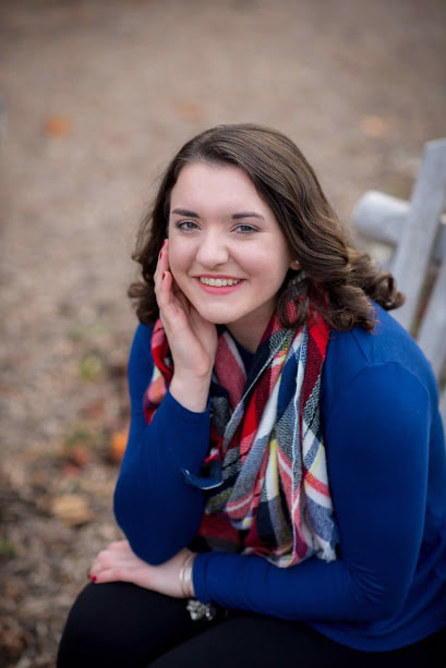
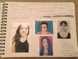
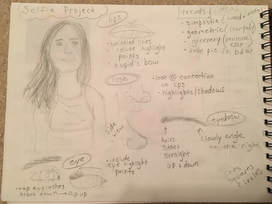
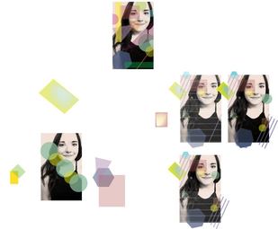
For my self portrait I knew I wanted to do it digitally. This quickly became a challenge for me however, because I didn't realize how hard it would be for me to do. I was inspired by a reference image I found (b&w picture in sketchbook) and wanted to follow the same idea of basic line and shape. Part of the way into the process, I felt like I had hit a wall. I didn't want to over crowd the piece with too much, yet I also felt like it didn't have enough at some points. To try and overcome this problem, I created fewer, larger shapes, that overlapped more. This project was a learning experience and I will take what I learned from it into my next project.
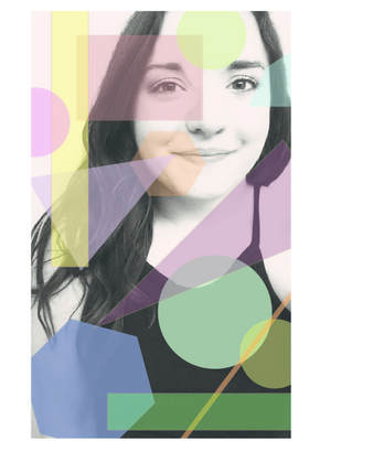 Final My sketches to my final project did vary a little. I went from the idea of just lines forming shapes, to solid shapes, to overlapping opaque shapes. I began by editing my picture into black and white and raising the contrast. Then from there it was just trial and error with the shape placement. As "easy and simple" as the piece may look, I did actually spend a lot of time on shape placement, color, and transparency. I know this is not my best work, but I think it was fun to experiment and try new things.
0 Comments
|
AuthorI am a senior art student at Shippensburg Area Senior High School with a love for graphic design, interior design, and photography. Archives
December 2017
Categories |

 RSS Feed
